


In Shopify default Debut theme, there are sections called “image with text” and “image with text overlay”. You can use them to put an image with text on your home page, but you can’t set different images for Desktop or Mobile, so the reality is it is very difficult to make one image size to support both Desktop and Mobile and make them both looks perfect on two devices.
In order to solve the above problem, we need to customize the default theme, here we will use the Shopify Debut theme to show you how to implement this functionality, I will guide you through the whole process following the below steps:
- define your sections in the Shopify Debut theme
- add image set in the section
- put our CSS code into the theme
- debug and test
- publish the theme
Define your own sections
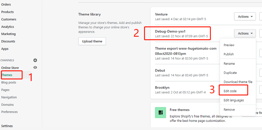
login to your store backend,select your theme to edit code

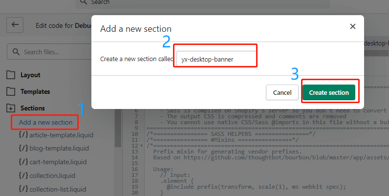
Add new section called “yx-desktop-banner”,then your can see a liquid file called yx-desktop-banner.liquid will be added in your sections directory.

Repeat above step to create the other section named as “yx-mobile-banner”.
Add Image Picker to the section
Click the above created yx-desktop-banner.liquid file to edit it. Delete all the default codes in the file, replace them with the below lines:
<div class="page-width yx-desktop-banner-container yx-mobile-hidden">
 <div class="container-full">
   {% for block in section.blocks limit: 1 %}
	<img class="img-responsive lazyload"  data-src="{{ block.settings.yx_image_picker | img_url: '2000x' }}" />
   {% endfor %}
</div>
</div>
{% schema %}
  {
    "name": "YX Desktop Banner",
    "class": "yx-desktop-banner-section",
    "max_blocks": 1,
    "blocks": [
    {
      "type": "image_picker",
      "name": "Desktop Banner Image",
      "settings": [
        {
          "label": "Desktop Banner Image",
          "id": "yx_image_picker",
          "type": "image_picker"
        }
      ]
    }
  ],
 "presets": [
    {
      "name": "YX Desktop Banner",
      "category": "Home",
"blocks":[{"type" : "image_picker"}]
    }
]
  }
{% endschema %}
{% stylesheet %}
{% endstylesheet %}
{% javascript %}
{% endjavascript %}
You can get the above file directly from GitHub.
Save it.
Replaced yx-mobile-banner.liquid file content with the following lines:
<div class="page-width yx-mobile-banner-container yx-desktop-hidden">
 <div class="container-full">
   {% for block in section.blocks limit: 1 %}
	<img class="img-responsive lazyload"  data-src="{{ block.settings.yx_image_picker | img_url: '750x' }}" />
   {% endfor %}
</div>
</div>
{% schema %}
  {
    "name": "YX Mobile Banner",
    "class": "yx-mobile-banner-section",
    "max_blocks": 1,
    "blocks": [
    {
      "type": "image_picker",
      "name": "Mobile Banner Image",
      "settings": [
        {
          "label": "Mobile Banner Image",
          "id": "yx_image_picker",
          "type": "image_picker"
        }
      ]
    }
  ],
 "presets": [
    {
      "name": "YX Mobile Banner",
      "category": "Home",
      "blocks":[{"type" : "image_picker"}]
    }
 ]
}
{% endschema %}
{% stylesheet %}
{% endstylesheet %}
{% javascript %}
{% endjavascript %}
You can get the above file directly from GitHub.
Don’t forget to save it as well.
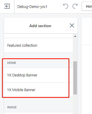
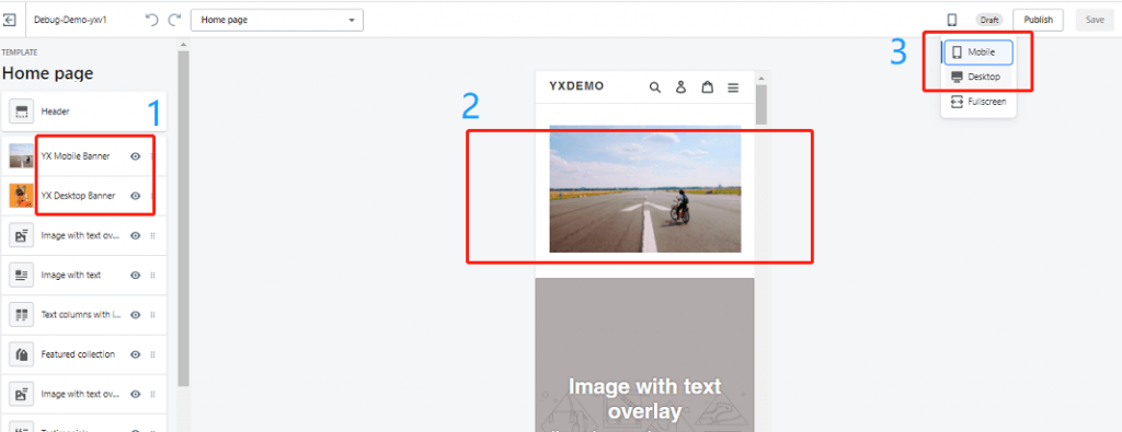
Now when you customize your theme, click [Add section] you will see two new sections: ”YX Desktop Banner” and “YX Mobile Banner“.

Add CSS codes to control our style
After you add newly created sections to your home page, obviously we don’t want to show both of them on mobile and desktop. We want to show a mobile banner on mobile and show a desktop banner on the desktop only. How to do this? you may have noticed we have added a specific class named “yx-desktop-hidden” for the mobile banner container and put a class named “yx-mobile-hidden” into the desktop banner container. And we have given mobile and desktop banner container-related class name “yx-mobile-banner-container” and “yx-desktop-banner-container“. Now we can easily use a CSS style to control them.
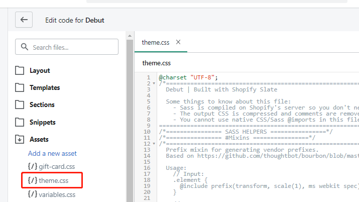
add the below CSS style codes into Debut theme CSS file. Your theme.css ( for old version Debut theme it will be theme.css.liquid ) file will be under the Assets directory.

@media only screen and (max-width: 749px) {
   .yx-mobile-hidden{
      display:none;
    }
   .yx-desktop-hidden{
      display:block;
    }
}

@media only screen and (min-width: 750px) {
   .yx-mobile-hidden{
      display:block;
   }
   .yx-desktop-hidden{
      display:none;
    }
}
You can copy and past the codes from JSFiddle as well.
As you can see we use CSS @media and screen size(750px as a threshold screen width) to differentiate mobile from desktop.
Debug and Test
In order to get the best performance and visual looking, we highly recommend 1920(width) * 1080(height) for desktop and 800(width) * 800(height) for mobile. after you set your mobile and desktop banner image separately. you can preview your theme and switch between mobile and desktop to have a review.

If you don’t like the default style, you can customer them by adding special attributes for “yx-mobile-banner-container” class to control mobile banner style and do similar changes to “yx-desktop-banner-container” class for your desktop banner.
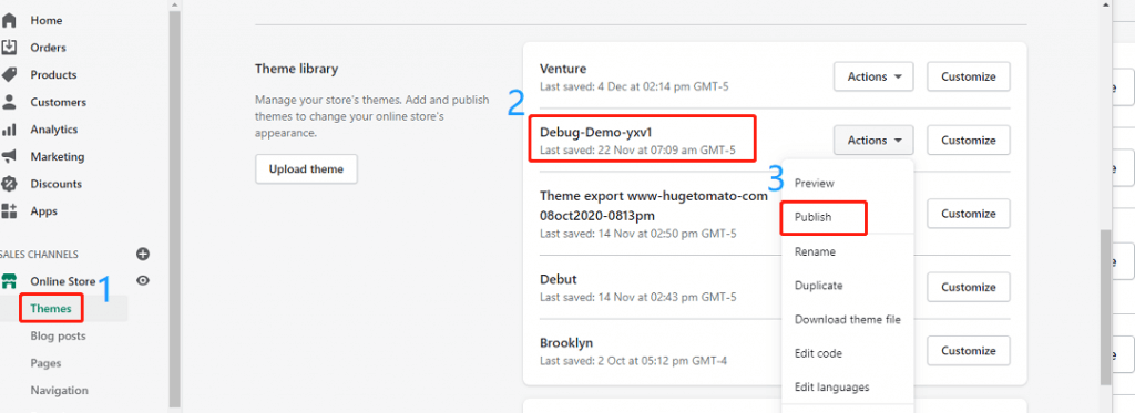
Make it live
So far all good, if you and your customer both are satisfied with the changes. Congratulations! you have got a big success, last step so easy just click the publish button to make it live.
publish a theme when you are editing it.


publish a theme from theme list. Themes ->Actions ->Publish.

Conclusions
Now you have got a basic idea on how to implement showing different image banners for Desktop and mobile, you can make it better for your theme. We only use the free Debut theme as an example, actually, a different theme maybe needs a few changes to adapt to your environment. if you find it is very difficult for you to accomplish these, please do not hesitate to leave a message at the below comment area or contact us, we will try our best to help you out.
TIPS
Shopify has deprecated the sass supporting in the theme editor, for more details please visit here


