Show Different Shopify Banner Image on Desktop and Mobile

In Shopify default Debut theme, there are sections called “image with text” and “image with text overlay”. You can use them to put an image with text on your home page, but you can’t set different images for Desktop or Mobile, so the reality is it is very difficult to make one image size to support both Desktop and Mobile and make them both looks perfect on two devices.
In order to solve the above problem, we need to customize the default theme, here we will use the Shopify Debut theme to show you how to implement this functionality, I will guide you through the whole process following the below steps:
- define your sections in the Shopify Debut theme
- add image set in the section
- put our CSS code into the theme
- debug and test
- publish the theme
Define your own sections
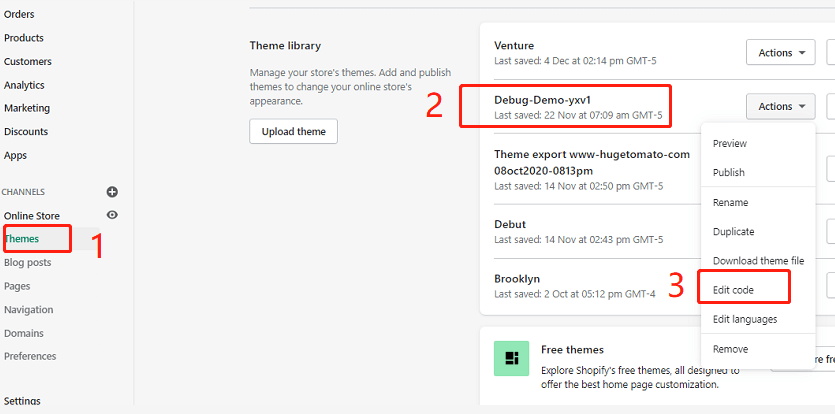
login to your store backend,select your theme to edit code
Add new section called “yx-desktop-banner”,then your can see a liquid file called yx-desktop-banner.liquid will be added in your sections directory.
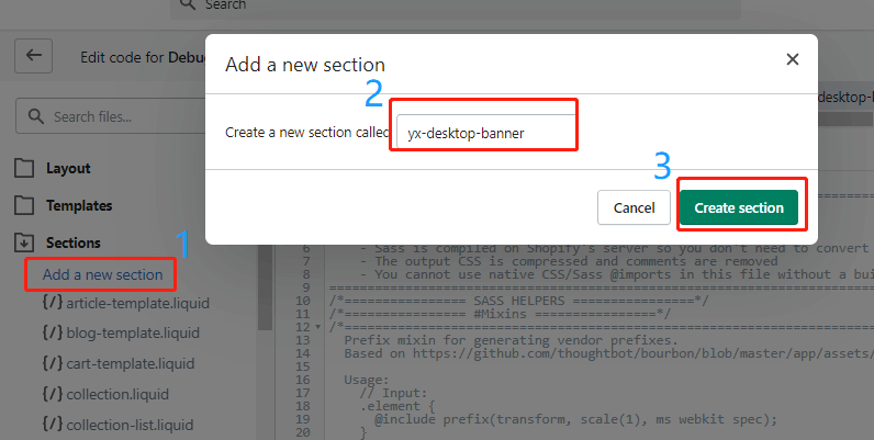
Repeat above step to create the other section named as “yx-mobile-banner”.
Add Image Picker to the section
Click the above created yx-desktop-banner.liquid file to edit it. Delete all the default codes in the file, replace them with the below lines:
<div class="page-width yx-desktop-banner-container yx-mobile-hidden">
 <div class="container-full">
   {% for block in section.blocks limit: 1 %}
	<img class="img-responsive lazyload"  data-src="{{ block.settings.yx_image_picker | img_url: '2000x' }}" />
   {% endfor %}
</div>
</div>
{% schema %}
  {
    "name": "YX Desktop Banner",
    "class": "yx-desktop-banner-section",
    "max_blocks": 1,
    "blocks": [
    {
      "type": "image_picker",
      "name": "Desktop Banner Image",
      "settings": [
        {
          "label": "Desktop Banner Image",
          "id": "yx_image_picker",
          "type": "image_picker"
        }
      ]
    }
  ],
 "presets": [
    {
      "name": "YX Desktop Banner",
      "category": "Home",
"blocks":[{"type" : "image_picker"}]
    }
]
  }
{% endschema %}
{% stylesheet %}
{% endstylesheet %}
{% javascript %}
{% endjavascript %}
You can get the above file directly from GitHub.
Save it.
Replaced yx-mobile-banner.liquid file content with the following lines:
<div class="page-width yx-mobile-banner-container yx-desktop-hidden">
 <div class="container-full">
   {% for block in section.blocks limit: 1 %}
	<img class="img-responsive lazyload"  data-src="{{ block.settings.yx_image_picker | img_url: '750x' }}" />
   {% endfor %}
</div>
</div>
{% schema %}
  {
    "name": "YX Mobile Banner",
    "class": "yx-mobile-banner-section",
    "max_blocks": 1,
    "blocks": [
    {
      "type": "image_picker",
      "name": "Mobile Banner Image",
      "settings": [
        {
          "label": "Mobile Banner Image",
          "id": "yx_image_picker",
          "type": "image_picker"
        }
      ]
    }
  ],
 "presets": [
    {
      "name": "YX Mobile Banner",
      "category": "Home",
      "blocks":[{"type" : "image_picker"}]
    }
 ]
}
{% endschema %}
{% stylesheet %}
{% endstylesheet %}
{% javascript %}
{% endjavascript %}
You can get the above file directly from GitHub.
Don’t forget to save it as well.
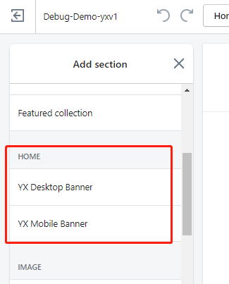
Now when you customize your theme, click [Add section] you will see two new sections: ”YX Desktop Banner” and “YX Mobile Banner“.
Add CSS codes to control our style
After you add newly created sections to your home page, obviously we don’t want to show both of them on mobile and desktop. We want to show a mobile banner on mobile and show a desktop banner on the desktop only. How to do this? you may have noticed we have added a specific class named “yx-desktop-hidden” for the mobile banner container and put a class named “yx-mobile-hidden” into the desktop banner container. And we have given mobile and desktop banner container-related class name “yx-mobile-banner-container” and “yx-desktop-banner-container“. Now we can easily use a CSS style to control them.
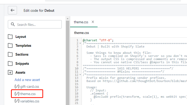
add the below CSS style codes into Debut theme CSS file. Your theme.css ( for old version Debut theme it will be theme.css.liquid ) file will be under the Assets directory.
@media only screen and (max-width: 749px) {
   .yx-mobile-hidden{
      display:none;
    }
   .yx-desktop-hidden{
      display:block;
    }
}

@media only screen and (min-width: 750px) {
   .yx-mobile-hidden{
      display:block;
   }
   .yx-desktop-hidden{
      display:none;
    }
}
You can copy and past the codes from JSFiddle as well.
As you can see we use CSS @media and screen size(750px as a threshold screen width) to differentiate mobile from desktop.
Debug and Test
In order to get the best performance and visual looking, we highly recommend 1920(width) * 1080(height) for desktop and 800(width) * 800(height) for mobile. after you set your mobile and desktop banner image separately. you can preview your theme and switch between mobile and desktop to have a review.
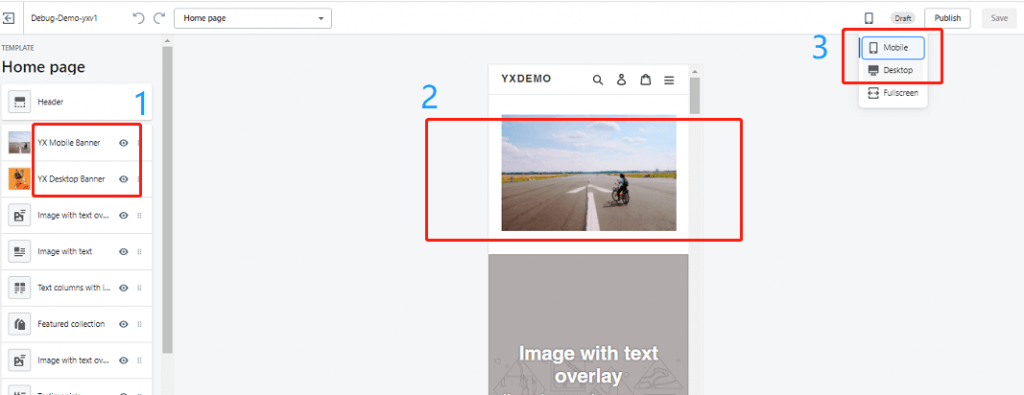
If you don’t like the default style, you can customer them by adding special attributes for “yx-mobile-banner-container” class to control mobile banner style and do similar changes to “yx-desktop-banner-container” class for your desktop banner.
Make it live
So far all good, if you and your customer both are satisfied with the changes. Congratulations! you have got a big success, last step so easy just click the publish button to make it live.
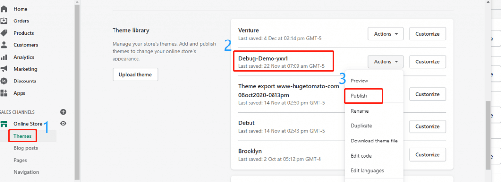
publish a theme when you are editing it.

publish a theme from theme list. Themes ->Actions ->Publish.
Conclusions
Now you have got a basic idea on how to implement showing different image banners for Desktop and mobile, you can make it better for your theme. We only use the free Debut theme as an example, actually, a different theme maybe needs a few changes to adapt to your environment. if you find it is very difficult for you to accomplish these, please do not hesitate to leave a message at the below comment area or contact us, we will try our best to help you out.
TIPS
Shopify has deprecated the sass supporting in the theme editor, for more details please visit here



Hi,
I have followed the steps and successfully added the Mobile and Desktop banner. However I have 2 issues.
1- I am still seeing the background image of the desktop banner on the mobile view, though the background image of the mobile banner is not visible on the desktop view.
2- I would want to make both the banners full width and the section height medium, same as the image with overlay text
Please help me with these 2 queries, it would be a great relief
1. Yes you are right, actually, we load the desktop and mobile background images just hide or show them based on specific screen size.
2. if you want to have a full-width banner, you can set the banner container width with 100vw
Amazing! Everything works perfect, thanks for your tip. Im trying to set the banner container in the mobile banner, full-width. How can I do this? Thanks in advance.
Hi Quique, sorry for reply late
as for full-width , you just need to set as below:
.yx-desktop-hidden{
width: 100%;
padding: 0 !important;
}
.yx-mobile-hidden{
padding: 0 !important;
max-width: 100vw !important;
}
Hi, may i know exactly where to place this code?
just update your theme related css file normally in your store’s Assets/theme.css file
Hi
Banner Image on Desktop and Mobile are really working well, to make clickable by adding image link and add slideshow how to do it, please help me
Hey, thanks so much for this guide.
But I am still getting the banner from the desktop and mobile appearing on the same screen. Do you know how I can fix that?
It works. Can you please help me on how do i add clickable buttons to these Banner.
I want to add a button to these banners to take them to a collection page
Hi Ashish,
if you want to add buttons to these banners
please refer to :
https://www.shopify.com.au/partners/blog/building-a-clickable-call-to-action-button-for-your-shopify-theme
to add a CTA section
then put this section into the banner
you can control their position in the banner with CSS absolute position attribute.
when I got time, I will write another article with all details
Hi! If I want to make the banner I have just created link through to a collection page on my site, is there some extra code I can add in?
Thanks!
Currently easy way, you can hard code here:
just use A tag to wrap the img tag for example:
What section does this go in the code?
I’m trying to add a link feature to the banner that I created in tutorial. How do I do this?
This has worked perfectly – thank you so much!
Hi, thanks so much for this! Where do you put this code though to add it in so the image can be linked to another page?
@shopifyguru.
Hi, for the full-width banner, in which file to set the banner container width with 100vw?
I followed the instructions, and it works, but it is a banner image, but I need an image with overlay text, is it possible? Thanks
hi eric , please try this:
.yx-desktop-hidden{
width: 100%;
padding: 0 !important;
}
.yx-mobile-hidden{
padding: 0 !important;
max-width: 100vw !important;
}
Hi, I’m trying to do the same (make the desktop and mobile banners full width), but I’m unsure whereabouts in the code I’m supposed to paste the above code in? Please can you help?
put the codes at the bottom of your theme file:
your theme file should be :
Assets\theme.css.liquid
Hello! I’m trying to make my banner full width on desktop mode, however I cannot seem to get it right. I have added the code provided below in the Assets folder, theme.css but nothing happens. Thank you in advance!
Are you using the Debut theme ? or what else theme are you using?
Hi, You’re the best! I was searching for this for literally 3 days. I have one big concern hope you might be able to help! Everything is fine with the section but there is some same between the header and banner! I would like to get rid of that space between the header and the banner if possible. Can we make it like image overlay section. Hope to get your response asap! Once again thank you!
Hi Simant, my pleasure.
as for space between header and banner you can change css file to git rid of them
hopefully this screenshot can help you:
https://mj.awkiss.com/wp-content/uploads/2021/06/banner-image-space-removed.png
could you possibly explain this. Will I find this section in ‘inspect’? or in theme.css. Are we to decrease the numbers? I just wanted to get rid of the gap between the banner and the header. Thank you!
You just need to set
.main-content {
padding-top: 0 !important;
}
add the above codes in your theme.css file
How to do it? Please help
You just need to set
.main-content {
padding-top: 0 !important;
}
add the above codes in your theme.css file
.yx-desktop-hidden{
width: 100%;
padding: 0 !important;
}
.yx-mobile-hidden{
padding: 0 !important;
max-width: 100vw !important;
}
我想问下这个代码是加在哪里的
please put them in your theme.css file, should be ok
anyway depends on your theme
each theme should have at least one theme.css file
just find it, and put them in.
put the codes at the bottom of your theme file:
your theme file should be :
Assets\theme.css.liquid
Hi, I’m trying to do the same (make the desktop and mobile banners full width), but I’m unsure whereabouts in the code I’m supposed to paste the above code in? Please can you help?
put the codes at the bottom of your theme file:
your theme file should be :
Assets\theme.css.liquid
I follow all the instruction but I still see both the mobile and desktop view on the main page? What will be my mistake?
Hi, both yx-desktop-banner and yx-mobile-banner appear on the mobile and desktop homepage. Anyway, how can I rectify this problem?
Could you please double check your theme.css.liquid file , you put the related CSS codes in ?
Or can I have you store URL so that I can check as well?
Hi, my URL is https://neuuwellness.com/. I put the code into Assets > theme.css without the .liquid. Also at layout found theme.liquid but without the CSS. Maybe is it the version issue?
Starting recently new versions of Shopify theme will not have SASS based CSS files.
Even if you download a new version from the theme store if the liquid, or sass, version of theme.css still doesn’t exist then most likely that theme has been converted to no longer use the .scss.liquid version as part of Shopify’s depreciation of the SASS language in favour of a modern CSS standard workflow.
Anyway, we can work around it with theme.css or any better approach?
Are you using Debut Theme?
I just tested theme.css still there ( Assets / theme.css )
you just need to put the codes in this file.
Good luck.
I already put the code inside Assets > theme.css but I still see both yx-desktop-banner and yx-mobile-banner with desktop and mobile view
Can I have your store link and password as well, will look into the details
Hi There!
Would this also work for slideshows?
How to say, I think you can use the same logic for your slideshows. Please have a try, if not working please share me your store link and password, so that I can have a look.
Hi Amelia,
have you tried this trick by adding slideshow, instead of a Banner?
@shopifyguru, maybe you can help me with adding a different slideshow for Desktop and Mobile?
yes, I can ,please give me access credentials
my site is neuu-wellness.myshopify.com and the password is neuu. thank.
Sorry to reply later, I have checked your website.
From your theme.css file, I can found yx-desktop-hidden .
but from your front-end code, I mean in the HTML part , I can’t find where did you put it.
so please check your yx-mobile-banner.liquid if you have put the correct codes in
is there away to add a shop button on the desktop image? 🙂
Definitely, You can
When I got time, will write an article about this.
please give me some time.
I have tried many times to solve this problem with the solutions provided in other blogs, but couldn’t be successful and always found some error in the process. At last, found your post, and It rocks! Thanks a lot for sharing.
You are welcome.
My pleasure.
i am adding in prestige theme the same code provided now section option is showing but dont see images on homepage what will be the issue plz help
Sorry I haven’t tested on prestige theme.
If you can share your store URL and password, I can have a look
Hi, it worked thank you. I need this feature in the hero section how can I apply the CSS of the hero section to this section
Do you only want to apply CSS ?
Thanks for this!
How can I update the schema so I can add a url input box to the same section? I know I can hard code it but it won’t be user friendly for the team… I’ve tried copying your code and adding a ‘url’ element but I keep getting schema errors.
May I know what’s the error message you got?
HI there,
Everything worked, but I can’t seem to make the image that I added a url link to show the image. it links to the page I want it to, but it doesn’t show the image i selected. How do I display the image?
Could you please share your store URL and password, I can have a look.
Hey, sure.
https://allayandco.ca/
cleuni
from your store, what I can see is you did it all correct, your image has been shown up already for mobile and desktop, a little bit confused what the problem you got, can you tell me more details?
The image with the shop now button was the one I wanted to make clickable. linking people to the shop all page. I made two versions of your code. so, I have YX Desktop Banner and YX Desktop Banner2. the second one I added a link to, but the image doesn’t show up even though I selected an image. once on the website it the placement where the image should be says NO IMAGE.
I hope that makes sense.
Do you have any ideas as to why? I could possibly send a screenshot of the coding.
yes, please send me a screenshot and codes
Do you have an email or somewhere where I can post them? Below I copied the code I used for the banner. I just want the image to link to another page but it won’t show the image I selected.
MY BANENR CODE
—————
{% schema %}
{
“name”: “YX Desktop Banner”,
“class”: “yx-desktop-banner-section”,
“max_blocks”: 1,
“blocks”: [
{
“type”: “image_picker”,
“name”: “Desktop Banner Image”,
“settings”: [
{
“label”: “Desktop Banner Image”,
“id”: “yx_image_picker”,
“type”: “image_picker”
}
]
}
],
“presets”: [
{
“name”: “YX Desktop Banner”,
“category”: “Home”,
“blocks”:[{“type” : “image_picker”}]
}
]
}
{% endschema %}
{% stylesheet %}
{% endstylesheet %}
{% javascript %}
{% endjavascript %}
Hello, may I know for the slider, is it all the steps above will be the same as well?
Sorry for slider it will be different
Can you help me with adding a different slideshow for Desktop and Mobile?
Thank you in advance!
Thank you for this post, but I am a little confused. I followed the guide 3 times now, but I still get the desktop banner showing in the mobile view and vice versa. How can I fix this?
Hey, thanks for the post. But I was a little confused because I followed the guide 3 times, but I still get the desktop banner showing in the mobile version, and vice versa. Do you know how to fix this?
Can you share your store url and password so that I can have a look?
Hello,
I have tried to do this tutorial three times, but I keep getting the banner of the desktop appearing on the mobile version and vice versa (the mobile banner showing on the desktop version).
Does anyone know how to fix this?
Thanks in advance
Can you shave your store URL and password so that I can have a look?
Would love it if there were a workaround for Dawn theme, unfortunately the image doesn’t display.
Sorry did not test with Dawn theme, but I don’t think it is hard to get it works, Could you please share your URL and view pwd?
Hello. Is any update to make it work in the Dawn theme available?
Dear all,
I have followed the steps you provided in the article “Show Different Shopify Banner Image on Desktop and Mobile” for the DEBUT theme back then.
However, now we are using the DAWN Theme and would like to do the same but unfortunately you cannot do the same in this particular theme.
Do you have an updated article for the DAWN Theme, where you can also click on the images?
Best regards,
Daniel
hello! Thanks so much for this it worked perfectly! There is only one thing i would like your help with.. In the mobile version de banner is not full width it has white spaces on both sides. Is there anyway I can make it full width?
Thanks!
https://www.adinausa.com/
crewck
Hi you just need to change as below:

Hi this works perfectly for me – thank you. I’m wondering if I can do the same with banner images on the collection pages? Is that possible with the Debut theme?
glad to hear it can help you , will have a look if can be done for collection page, maybe possible
I am also looking to implement in collection page. did you get time to check on the same? if you have already done, please provide me the link to implement
Is there a way to do something similar on the collection pages – have 2 image pickers for the banners, one for desktop and one for mobile?
please refer to the above reply
Hi, Thank you for sharing this useful knowledge. However the mobile is not able to show the mobile banner, it only shows the desktop banner on the mobile. Hope you can give some help.
Hi there. I want to apply this to a slideshow as apposed to a static banner, and be able to add a URL link as per the slideshow function in the Supply theme. Do you have the code for this. Thanks.
Sorry, I don’t have at the moment.
How can we make these banner clickable links? I’d like the banners to be linked to the product page. Thanks so much!
you can edit yx-desktop-banner.liquid and yx-mobile-banner.liquid
add your link to the images
should work for you
All works great, however the images are not constraining to the page width on either desktop or mobile. Adding sideways scroll to home page. Could you advise how to resolve this issue please? Thanks in advance
which theme are you using?
Having this issue using narrative
Amazing solution, worked very well on Brooklyn theme. I have two queries though.
1. There is a lot of top margin space, that i am unable to remove in both desktop and mobile, I want zero margin and the menu options to overlay on the image.
2. Is there any way to add slideshow images for mobile and desktop instead of one image? We are aiming for slideshow section look for both mobile and desktop. Thanks in advance.
1. what’s your image size? if your image size is big(including ratio can cover your maximum screen size) enough, should not be any space there.
or Could you please share your story URL let me have a look
2. I think it should be ok to support slideshow, but need a lot of codes, haven’t got time to do this recently
but I will put it in my plan, please keep eye on
Hey does this work on other themes? I am using Debutify – I tried it and the options dont seem to show up when i go to customize. thanks
Hi, do you have an update on how to add the button inside the banner and make the button responsive to browser sizes?
I followed the link you attached and manage to create a button and set the positions, but when I change browser sizes, the button moves into a different spot
Dear all,
I have followed the steps you provided in the article “Show Different Shopify Banner Image on Desktop and Mobile” for the DEBUT theme back then.
However, now we are using the DAWN Theme and would like to do the same but unfortunately you cannot do the same in this particular theme.
Do you have an updated article for the DAWN Theme, where you can also click on the images?
Best regards,
Daniel
Do you have an updated article for the DAWN Theme, where you can also click on the images?
Hello Shopifyguru, I’m trying to include the code into my Dawn Theme in Shopify, but i can’t seem to add the code into my assets. For Dawn Theme, they only have individual assets instead of the theme.css, able to assist and let me know where to include the code?
Hello,
I use the Theme Sense and it does work… but not completly.
I can add a Section and Picture, but it can not be seen.
Could you help us?
Hi,
Can you please help us? We tried add your code but we have DAWN theme?
hello i need help please
What happens is that I am using the dawn theme and I can’t find where to paste the last code of the css
since I don’t have the debut theme
please
hello i need help please
What happens is that I am using the dawn theme and I can’t find where to paste the last code of the css
since I don’t have the debut theme
please
,
Hello,
When I’m adding a new asset, it’s asking me to select the format now from a dropdown menu:
.css
.css.liquid
.scss
.scss.liquid
.js
.js.liquid
which one should I select? I tried with scss.liquid and it gives errors:
This file contains the following errors:
Line 8 — Liquid syntax error: Unknown tag ‘schema’
can you please help?
many thanks,
Hello, please please can you help, this is exactly what I needed and have been trying to do for months.. but now there’s no CTA option? or even a way to make it click through?
Is there anyway to make slideshows have a mobile image option too??
Im really desperate and really struggling
Yes, you can, Can I have your shopify website for review